‘Everything is Design’, so said Paul Rand. Rand would know; he’s the graphic designer of, among other things, the logos for IBM, ABC television, Westinghouse, Cummins Engines, and UPS. Pretty much anyone with eyeballs has seen Rand’s work.
For watch enthusiasts, design might not be everything, but it’s a lot. What makes a watch special, in the end, are the design choices of its maker, particularly the watches in our price band. So let’s take a look at five watches from five design schools that you can wear proudly, and that also give you yet another chance to ‘watchsplain’ their aesthetics to your friends and family.
Prairie Style - Bulova X Frank Lloyd Wright | $650 (USD) £395 (GBP)

Image: Bulova
All of our design styles have various high priests and priestesses, but Prairie Style has only one: Frank Lloyd Wright. FLW might be the only American architect you know by name (Frank Gehry might be the other). You'd certainly know if your neighbourhood included a Frank Lloyd Wright-designed house. His homes stretched low and wide, with flat roofs, open plans, and long horizontal lines that made them feel less built on the land than emerging from it. It would also be the neighbour with the constantly leaking roof, but whatevs. Frank Lloyd Wright!
The Frank Lloyd Wright Foundation has had a long-term relationship with American legacy watch brand Bulova. The brand is now part of the Citizen Watch Group. This watch is a tribute to the Toufic H. Kalil House in New Hampshire, one of Wright's 'Usonian' houses. Usonia, by the way, is a term Wright used for America: The United States of North Independent America. An excellent name for a design theme, we believe, but it does not make a great sports chant.
“U-S-O-N-I-A!! U-S-O-N-I-A!!!”
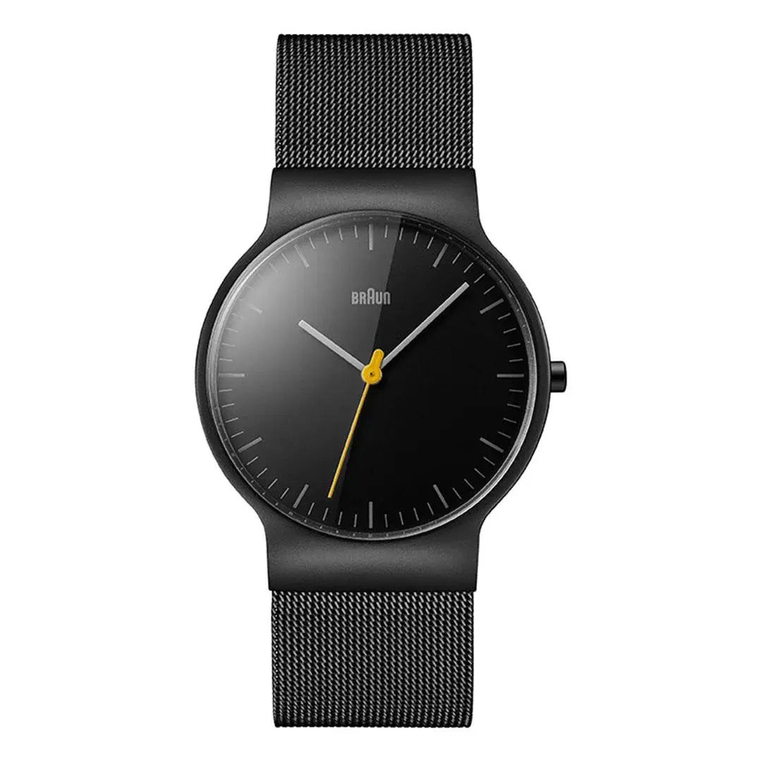
Bauhaus/Functionalism - Braun BN00021 Classic Slim | $295 (USD) £185 (GBP)

Image: Braun
We know Junghans and Nomos are the go-to watch brands for Bauhaus enthusiasts. We also know that it's unusual for a watch newsletter to feature a brand that also makes toasters, irons, juicers, waffle makers and essential manscaping tools.
But hey, Braun makes a lot of good stuff (and we love a good waffle.) More importantly, this watch channels the aesthetics of Braun's legendary designer, Dieter Rams. We're stretching it a bit to call Rams a Bauhaus designer. Functionalism, the heir apparent to the Bauhaus, was Rams’ ‘Jam' (sorry), turning the design principle 'form follows function' into 'less, but better.' Ram's 10 Principles of Good Design is a sacred text among designers, the influence of which you see if you use any product made by Apple.
Anyway, back to this watch: comfortably called Bauhaus and comfortable to wear with a slim, 38mm case. It's a Good Design Award Winner, and we'd never say no to a Milanese bracelet. This watch has serious design pedigree, the perfect watch to wear on that next trip to Cooper Hewitt or the V&A.
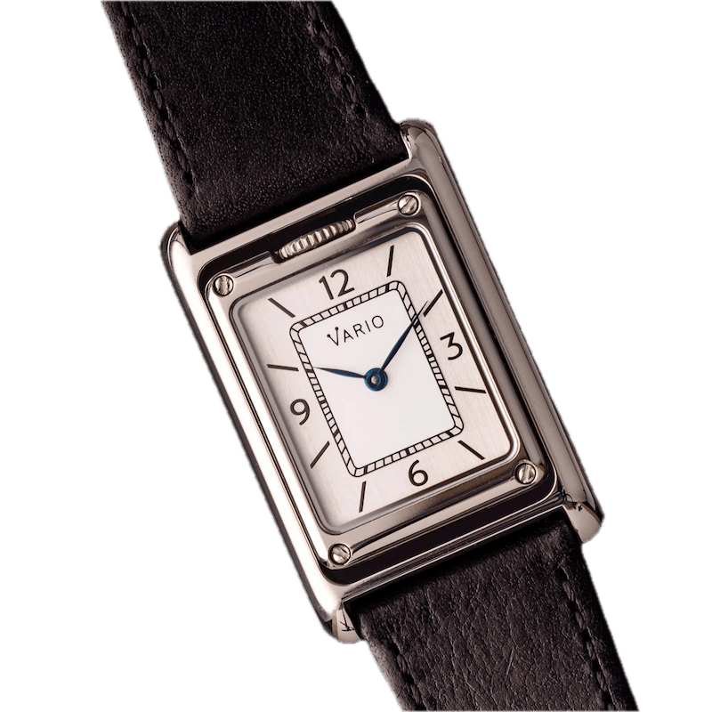
Art Deco - Vario Versa | $428 (USD) £330 (GBP)

Image: Vario
Dominating design in the 1920s and 30s, Art Deco didn't get its name 'Art Deco' until 1966, at a Paris retrospective. Later (in fact, 1968), British art historian Bevis Hillier popularised the term in his book Art Deco of the 20s and 30s. Until then, the modern, zig-zaggy style of the Jazz era was known as "le style moderne" or "Jazz Moderne", or simply "zig-zag style". (We'd vote for ‘Jazzy zig-zag’.)
Art Deco is a 'Total Style.' There isn't a design discipline that hasn't adopted Art Deco. There are Art Deco buildings, Art Deco interiors, Art Deco sculpture, Art Deco cars, Art Deco planes, Art Deco locomotives, Art Deco toasters and Art Deco vacuum cleaners. So naturally, there are Art Deco watches. Jaeger LeCoultre's Reverso is a classic example.
Which makes the Versa, by Vario, a classic homage to the classic Art Deco watch. For our readers who are Reverso fans, the Versa (this paragraph has now entered tongue twister land) is a 'Duoface': flip the watch, and you're showing a different time zone. And unlike the Reverso, the Versa fits comfortably in our price range. It's also an iF Design Award winner this year.
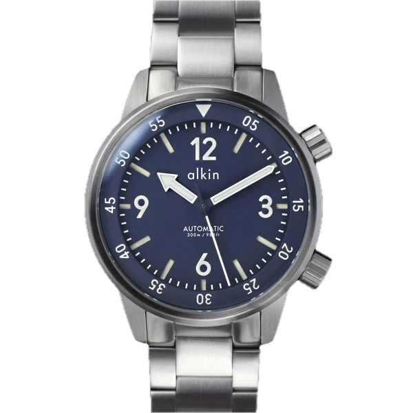
alkin Model 2 - $569 (USD) £425 (GBP) | International Typographical Style

Image: alkin Watches
Europe, mid-20th century: a continent recovering from yet another war. You wouldn't blame designers for seeking out a style that brought order to the whole enterprise. Enter International Typographical Style.
Say goodbye to curls, ornamentation, serif fonts, colour and extravagance of Art Deco. Say hello to the grid (this school is also known as the 'Swiss Grid'), along with proportionality, asymmetry, and white space. This is the design movement that gave us Helvetica, the One Font to Rule Them All (and the go-to typeface for countless brands).
Also, hello to the alkin Model 2. Alkin (stylised 'alkin') is the brainchild of Bristol-based designer Charlie Fowler. The Model 2 finds its happy place on the Swiss Grid, with plenty of white (well, blue) space, asymmetrical crowns, and an original sans-serif font (designed by British typographer Gareth Hague). The alkin 2 is one of our favourite watches: a thoughtful, tidy design that, in the highly derivative world of watch design, doesn't look like anything else.
Brutalism - Maven BR-01 Silver | $172 (USD) £144 (GBP)

Image: Maven Watches
Staying in post-war Europe: budgets were thin, as was optimism, and architects suddenly discovered that raw, unadorned concrete could be poured into just about any shape they fancied. How fun!
From the French term 'beton brut' ('raw concrete'), Brutalism is, shall we say, an acquired taste. The style gets a bad rap, in part because some Brutalist designs are pretty ugly (think London's Euston Station), and in part because some Brutalist buildings replaced something much more beautiful (think London's Euston Station). Speaking of London, the Royal National Theatre captures the aesthetic perfectly: it's simultaneously one of the most loved and hated buildings in the city.
Given that concrete plays a starring role, Brutalism does not naturally lend itself to watchmaking. Who wants a watch made of concrete? Fortunately, that did not stop Maven. The BR-01 is Brutalist (the BR in the name stands for Brut), and Maven's design ethos is to create "moments of tranquillity and joy to modern-day living." Now, we would not choose the Brutalist aesthetic to achieve that, but Maven did, and they have somehow pulled it off. At 32mm, it is comfortably unisex, pleasingly straightforward, and a Red Dot Design Award winner, too. It's all love, no hate, for Maven.
We’ve got ‘designs’ on your next watch.
Watch500 publishes two newsletters: the bi-weekly News from the GMT, covering watch news and industry insights, while The Five brings you themed watch picks every week.
Get the best of the $500 watch world - new releases, brand discoveries, industry insights, and the stories behind timepieces that are eminently affordable, framed around poor cultural references.
And feel free to pass this along to someone else who doesn’t need another watch, but will probably buy one anyway.
Prices are approximate, converted to GBP or USD when needed, and they may wander a little depending on tariffs, exchange rate mischief, or the usual forces beyond our understanding or control.